 lunedì 4 gennaio 2010
| Convard & Juillard, Le Dernier Chapitre |
 Le Dernier Chapitre era una serie di quattro volumi nei quali Didier Convard e André Juillard si divertivano a immaginare da vecchi gli eroi di alcune serie fumettistiche. I quattro volumi, pubblicati tra il 1998 e 1999, erano dedicati a Blake & Mortimer, Barbe-Rouge, Les Pieds Nickelés e Johan e Pirlouit. I testi di Convard, pieni di affetto e sottile umorismo, abbinati ai bellisssimi disegni di Juillard, facevano di questi quattro volumetti delle preziose perle di buon gusto e raffinatezza. La serie viene ora riproposta in volume unico (Dargaud 2009, 29). Il volume è un eccellente esempio di come unottima idea possa poi venire compromessa da scelte sbagliate e da disattenzioni varie. Una scelta sbagliata è quella di adottare un corpo tipografico standard per le varie lettere che Blake e Mortimer si scambiano, mentre nel volume originale erano scritte a mano o a macchina, a seconda del caso. Presumibilmente questo è stato fatto per ridurre il numero di pagine, ma in questo modo si perde il fascino delle lettere originali. La disattenzione si traduce invece in diversi refusi che si sono introdotti con questa ricomposizione del testo (Ramal invece di Kamal a p. 25 e 33, Ramdall invece di Kendall a p. 10). Nonostante ciò, il volume è unottima iniziativa, particolarmente per coloro che non avessero acquistato tutti e quattro i volumi originali. Il volume unico ha anche il vantaggio di una nuova copertina appositamente realizzata da Juillard per loccasione. [Su Amazon: click qui.] Articolo di Guido Vogliotti.
Le Dernier Chapitre was a series of four volumes in which Didier Convard and André Juillard imagined the heroes of comic series in their old age. The four volumes, published between 1998 and 1999, were dedicated to Blake & Mortimer, Barbe-Rouge, Les Pieds Nickelés and Johan & Pirlouit. The loving, often humorous texts by Convard, coupled with the beautiful drawings of Juillard, made these four volumes precious little jewels of good taste and finesse. The series has now been reprinted as one volume (Dargaud 2009, 29). This is an excellent example of how a brilliant idea can be marred by bad choices and carelessness. A bad choice is the fact of adopting a standard book type for the various letters exchanged by Blake and Mortimer, whereas in the original volume they were either handwritten or typed on a machine. This was probably done in order to reduce the number of pages, but it takes away much of the fascination of the original letters. Carelessness is exemplified by the various typos introduced in this process (Ramal instead of Kamal on p. 25 and 33, Ramdall instead of Kendall on p. 10). Nonetheless, the volume remains a welcome initiative, particularly for those who did not buy all four volumes when they originally came out. The new volume has the added bonus of a new cover drawing by Juillard made especially for this edition. [Article by Guido Vogliotti]
Etichette: BD, BM, Recensioni, Vogliotti


mercoledì 23 dicembre 2009
| Amici di Jacobs: numero 6 |
 Il sesto numero del notiziario dellassociazione che raggruppa i fan di Edgar P. Jacobs, il creatore della serie di culto Blake e Mortimer, è pronto. Se ne parla nel blog dedicato e vi scoprirete che è presente anche un articolo di un nostro amico e collaboratore, Guido Vogliotti, noto esperto della serie in questione, che ha in lavorazione un saggio sul mondo sotterraneo nellopera di Jacobs.
Le n° 6 de la revue de l'association Les Amis de Jacobs, daté de septembre 2009, vient d'arriver chez les membres de l'association. Au sommaire: Editorial : Vivre dans l'Art, un art de vivre, par Christian Viard - L'Assemblée Générale, projets et réflexions..., par Bernadette Bréchoteau et Françoise Nicolas - Les secrets d'Edgard - 3ème partie, par Philippe Biermé - Sur Jacobs, dix ans après sa mort, par Dominique Petitfaux - Nieuwe oogst, nieuw leven (Nouvelle récolte, nouvelle vie) - De l'imaginaire à la réalité, par Jean-Marie André - Une vision de Jacobs, par Dominique Bréchoteau - Le monde souterrain dans les aventures de Blake et Mortimer, par Guido Vogliotti - Le vaisseau spatial, par Benoît Verley Full article: click here.
Etichette: BM, Recensioni, Vogliotti
mercoledì 14 ottobre 2009
| Bob e Bobette di Willy Vandersteen |
 Uno dei più grandi fumettisti belgi di scuola fiamminga è Willy Vandersteen (1913-1990), creatore di Suske en Wiske (Bob et Bobette in francese). Soprannominato il Brueghel del fumetto per il suo stile ornamentale ma anche per la sfrenata fantasia delle sue storie, in effetti trasponeva addirittura alcune scene della pittura fiamminga nei suoi fumetti (si veda Le fantôme espagnol), come già aveva notato P. Fresnault-Deruelle quasi 40 anni fa. Tra il 1949 e il 1959 gli fu chiesto di scrivere alcune storie per il settimanale Tintin, e in questi anni fu quindi sotto la direzione personale di Hergé, che cercava di portare il suo stile grafico sempre più verso la linea chiara e di imbrigliare la sua fantasia sfrenata. Questa collaborazione produsse otto storie che sono diventate note come la Serie Blu, per differenziarle dalle innumerevoli altre storie pubblicate prima e dopo questo periodo in albi brossurati con copertina rossa. Una mostra (Lépopée bruxelloise de Willy Vandersteen) si è tenuta questanno a Bruxelles proprio per ricordare questo periodo dellartista fiammingo. La Serie Blu viene ora riproposta dalleditore belga Edition Standaard in otto preziosi (ma niente affatto costosi) volumi disponibili individualmente che faranno la gioia di ogni vero appassionato del fumetto franco-belga. Queste storie, particolarmente dal 1955 in poi, sono talmente perfette dal punto di vista grafico da essere difficilmente distinguibili dalla produzione di Hergé. In particolare Les Martiens sont là, storia ambientata a Parigi, raggiunge forse un apice nel processo di affinamento e internazionalizzazione di cui la serie fu oggetto. Viene da chiedersi come mai Bob e Bobette non abbiano raggiunto una fama più internazionale nella scia di Tintin. Le ragioni sono principalmente due: da un lato Vandersteen era forse troppo tipicamente fiammingo per raggiungere la diffusione di Hergé. Dallaltro lunico personaggio ben caratterizzato e completo della serie è Mr. Lambique, mentre Bob e Bobette non si evolvono da un ruolo subalterno di aiutanti bambini abbastanza amorfi.
 One of the greatest comic creators in Belgium was Willy Vandersteen (1913-1990), the creator of Suske en Wiske (Bob et Bobette in French). He was nicknamed the Brueghel of comics both for his ornate style and for the fancy-free imaginativeness of his stories. Indeed, some of the scenes in Le fantôme espagnol are plain transpositions from Brueghel paintings, as P. Fresnault-Deruelle noted almost 40 years ago. Between 1949 and 1959 Vandersteen was commissioned to write some stories for Tintin, and during this time he was under the personal guidance of Hergé himself, who was trying to steer him towards a tidier, more composed graphic style and a less daring humour more in keeping with Hergés clear line. This collaboration resulted in eight stories that have become known as the Blue Series, to distinguish them form the countless other stories that were published as red soft-cover albums both before and after the Blue Series. An exhibition (Lépopée bruxelloise de Willy Vandersteen) was staged in Brussels this year to commemorate this particular period in the Flemish artists career. The Blue Series has now been reprinted by Edition Standaard in Belgium as a luxury but by no means expensive set of eight hard-cover albums (available individually) that should easily delight any comic fan of the Brussels school. These stories, particularly those from 1955 onwards, are so graphically perfect as to be almost indistinguishable from the work Hergé himself could have produced. In this respect, Les Martiens sont là, set in Paris, probably represents the peak in the process of refinement and internationalisation the series underwent. One might wonder why Bob et Bobette did not become better known abroad in the wake of Tintin. The reason is probably twofold: on the one hand Vandersteen was too typically and peculiarly Flemish to gain an international acclaim comparable to that of Hergé. Secondly, the only strong character in the stories is Mr Lambique, while Bob and Bobette do not evolve from the role of helpers of little distinction. Nevertheless, these eight stories are truly delightful and well deserve to be given a wider circulation. A reprint like this one (hard cover with cloth spine and gold impressions) is an overdue tribute to this greatly imaginative comic writer. (Guido Vogliotti)
domenica 13 settembre 2009
| Una visita al museo Hergé a Louvain-la-Neuve |
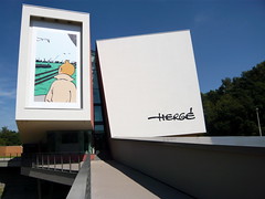 La mia visita al museo Hergé, recentemente aperto a Louvain-la Neuve, è stata una delle esperienze più appaganti negli ultimi tempi. L'edificio, costruito appositamente per ospitare questo museo dall'architetto Christian de Portzamparc consiste internamente di quattro blocchi separati e collegati da passerelle su ognuno dei due livelli in cui è articolato il museo. Questi quattro blocchi hanno pareti inclinate, talvolta curve, e sono dipinte in colori pastello con impressi motivi molti ingranditi di vignette di Hergé. Joost Swarte, l'artista che inventò la definizione 'linea chiara' negli anni 70, è responsabile per l'allestimento e le scenografie del museo, anche se vedendo le immagini dei suoi progetti sull'opuscolo del museo non sembra che tutte le sue proposte siano state attuate. L'edificio riesce mirabilmente a trasporre il mondo di Hergé e delle sue storie in forme tridimensionali a colori. Ci si sente immediatamente a proprio agio in questo ambiente, in cui si ritrovano le linee chiare, le forme e i colori che sono sempre stati il marchio di fabbrica di Hergé. Si può dire che il contenitore è perfetto per il contenuto. Il visitatore percorre quindi otto sale (iniziando dal piano superiore: Tappe di una vita, Creazioni molteplici, Una famiglia di carta, Cinema!, Il laboratorio, Il museo immaginario, Studi Hergé, La fama di Hergé). Il numero e la qualità di tavole originali, copertine, lavori pubblicitari, oggetti personali, foto, cartoline inviate agli amici ecc. è impressionante e i criteri espositivi sono ottimali. Da non perdere, su questo piano, il film di Vincent Baudoux in cui la linea chiara di Hergé viene esplorata minuziosamente dalla telecamera che scorre sulle immagini accompagnate da un fondo musicale. Il film costituisce un'attenta e piacevolissima analisi dello stile di Hergé. Nell'interessante 'museo immaginario' sono esposte le documentazioni etnologiche utilizzate da Hergé per la realizzazione delle sue storie.
  L'ultima sala della visita (La fama di Hergé, al piano inferiore) è una grande commemorazione del disegnatore in cui ad ogni disegno esposto corrisponde una citazione di autori come Joost Swarte, Haroun Tazieff, Alain Resnais, Philip Pullman, Balthus, Michel Serres, Bernard Pivot, Charles De Gaulle, Alain Saint-Ogan. In un breve video Michel Serres ricorda l'amico Hergé. L'ultima sala prima dell'uscita è costituita da una camera circolare (un tubo verticale) le cui pareti sono rivestite di copertine di Tintin in tutte le lingue: voci di bambini recitano i titoli delle avventure nelle varie lingue.Per quanto possa essere alta la vostra opinione dell'artista Hergé, è probabile che lascerete questo museo con un'idea ancora più lusinghiera dell'autore e della sua perfezione artistica. È vietato fotografare all'interno del museo, un divieto che non aiuta a dissipare l'immagine molto negativa che l'attuale management dell'impero di Hergé è riuscito a creare con scelte impopolari. L'altro punto dolente è che questo museo, per quanto eccezionale, non considera l'esistenza dei bambini: niente giochi interattivi, niente cartoni, in breve niente di tutto ciò che renderebbe felici i bambini. Questa è chiaramente una scelta consapevole dei proprietari del museo (è un museo privato, senza alcun contributo statale), che tendono a privilegiare il passato senza considerare il futuro; ma è un peccato, e non si può fare a meno di pensare che Hergé non avrebbe approvato questa scelta. In fondo tutto il suo lavoro era in primo luogo destinato ai bambini.
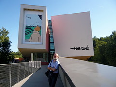 A Visit to the Hergé Museum in Louvain-la-Neuve. My recent visit to the newly opened Hergé Museum in Louvain-la-Neuve was one of the most enjoyable experiences I have had lately. The building first of all: it was built with the sole purpose of housing the museum by the architect Christian de Portzamparc. Inside, it basically consists of four blocks interconnected by passageways on each of the two levels on which the museum is articulated. The four blocks are tilted, with tapering walls and curves, painted in solid pastel colours, each wall being painted with a much-enlarged 'clear line' pattern taken from a Hergé case. Joost Swarte, the very artist who devised the concept of 'clear line' in the 1970s, is responsible for the layout and settings of the museum, but looking at his drawings in the museum booklet it would seem not all of his ideas have been put into practice.The building beautifully manages to transpose the world of Hergé and of his stories into three-dimensional forms and colours. One immediately feels at ease in this environment, finding the same clarity of lines, shapes and colours that was always Hergé's hallmark. You can't help feeling that the container is perfect for the content. Then the visitor goes through eight rooms (starting from the top level: Stations of a lifetime, Multiple creations, A paper family, Cinema!, The laboratory, The imaginary museum, Studios Hergé, Hergé's glory). The number and quality of original plates, covers, commercial artwork, personal objects and photos, postcards is stunning and everything is displayed in the best possible way. On the top floor don't miss the fim by Vincent Baudoux, the camera just pans across Hergé's clear lines accompanied by music, it is a very useful and pleasant analysis of his style. In the extremely interesting 'imaginary museum' the ethnological documents used by Hergé for the various stories are exhibited. The last room (Hergé's glory, on the lower floor) is a sort of commemoration of Hergé associating original artwork with quotations on the walls from the likes of Joost Swarte, Haroun Tazieff, Alain Resnais, Philip Pullman, Balthus, Michel Serres, Bernard Pivot, Charles De Gaulle, Alain Saint-Ogan.
 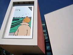 In a short video Michel Serres remembers his friend Hergé.The very last room is a vertical shaft section in which Tintin covers in all languages line the circular wall. Children's voices can be heard telling the titles in all languages.However high an opinion you may have of Hergé as an artist you are likely to leave the museum with the realisation that you never fully appreciated how great he really was and what level of perfection he had reached in his work.No photographs are allowed inside the museum, a stance that is unlikely to improve the very negative image the present management of the Hergé estate has created with a number of unpopular choices. The other lamentable point is the fact that this museum, excellent as it is, does not seem to consider the existence of children-no interactive games, no cartoons, nothing of what would easily make children happy. This is clearly a conscious decision by the owners of the museum (this is a private museum, no state subsidies) who have chosen to look back rather than to the future, but it is a shame and one can't help feeling that Hergé would not have approved of this choice. He worked for the children all of his life.
lunedì 17 agosto 2009
| E.P. Jacobs e il Picture Book of London |
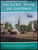 A Daniel Van Kerckhove spetta il merito di aver per primo individuato le fonti di La Marque jaune (Il marchio giallo) di E.P. Jacobs. Lo ha fatto nel suo dossier all'interno del volume di Claude Le Gallo Le Monde de Edgar P. Jacobs, Le Lombard, 1984. La principale di queste fonti è costituita dal Country Life Picture Book of London (1951), che Jacobs aveva acquistato durante il suo viaggio a Londra nell'agosto 1952. Questo brevissimo viaggio gli era servito a raccogliere materiale (le famose foto di Londra che Jacobs utilizzò copiandole direttamente dall'originale), e soprattutto le atmosfere, per la stesura di La Marque jaune. In effetti quella del 1951 era stata la prima edizione di questa fortunata serie di libri (The First Country Life Picture Book of London), editi ogni due/tre anni, e destinati ad un pubblico di turisti che proprio in quegli anni era in forte crescita nella generale ripresa del dopoguerra.
 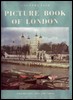 La serie fu estremamente popolare in Inghilterra, con tirature che si possono presumere piuttosto alte, per cui ancor oggi non è troppo difficile, per l'appassionato collezionista di Jacobs, reperire questo volume che si può trovare sia nell'edizione in volume singolo (1951, copertina qui a destra) utilizzata da Jacobs, e sia in un'edizione successiva che raccoglieva tali e quali i primi tre volumi (1951-1953-1956) in un volume unico (vedi la copertina qui a sinistra) di cui non viene riportato l'anno di pubblicazione, ma che non può essere anteriore al 1960, data della quinta ristampa del primo volume inclusa in questa raccolta. [Articolo di Guido Vogliotti] - Click qui per vedere alcune immagini tratte dalla storica guida, che potrete confrontare con l'albo Il Marchio Giallo della serie Blake e Mortimer. NdR.
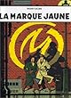 Daniel Van Kerckhove has the great merit of first having identified the sources for E.P. Jacobs' La Marque jaune (The Yellow "M"). He did it in a separate section in Claude Le Gallo's volume Le Monde de Edgar P. Jacobs, Le Lombard 1984. The main source was the first Country Life Picture Book of London (1951), which Jacobs had bought during his visit to London in August 1952. This very short trip provided him with the material (the famous London photos that Jacobs copied straight from the originals), but above all the atmospheres for the preparation of The Yellow "M". In fact, the 1951 edition was the starter of this successful series in which updated volumes were issued every 2/3 years, aimed at a public of tourists which was rapidly growing in the after-war years. The series was very popular in the UK,
  with circulations that can be assumed to be pretty high. Therefore it is not too difficult, even today, for the keen Jacobs collector to find this volume, be it the single volume edition owned by Jacobs (1951, see cover on the left) or a later combined edition which contained volumes 1, 2, and 3 (1951-1953-1956) in a single volume (see cover on the right) which does not bear a year of publication, but which cannot be earlier than 1960, the date of the fifth impression of vol. 1 included in this combined edition. [Article by Guido Vogliotti]
Etichette: approfondimenti, BM, Vogliotti
Partner: Anonima Fumetti - SILF (sindacato fumettisti, illustratori, animatori)
Commenta l'articolo - Agenda del Fumetto - Altre notizie, video, foto ecc. - Newsletter gratis - (C) afNews - ISSN 1971-1824 - redazione@afnews.info

--- the BABs & Ex l'extrazucca: copyright Gianfranco Goria ---
 Iscriviti a Post [Atom]
![]()